Concept · Self-directed

Pin. Remove. Pause.

Three reversible controls for Spotify’s Recently Played shelf. Each one completes in one or two taps.

Feature designInteraction modelConstraint mappingReversible by default

Self-directed concept. Recently Played is one of Spotify’s highest-traffic surfaces and one of its least controllable. This case study designs three additive, reversible controls without rebuilding the shelf or breaking the recommendation engine.

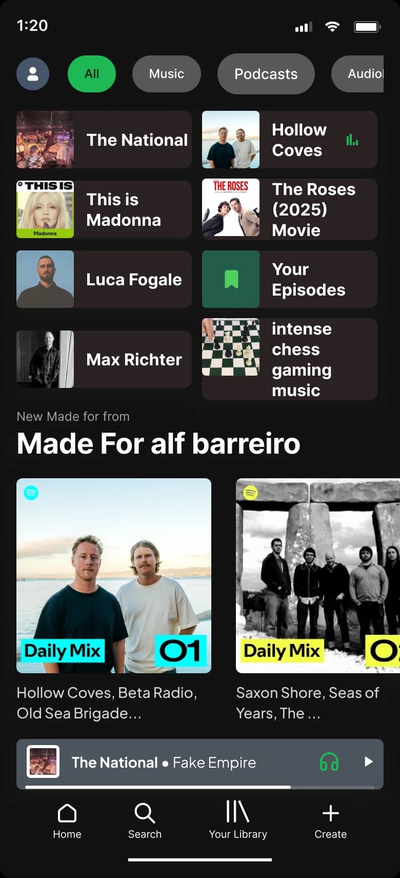
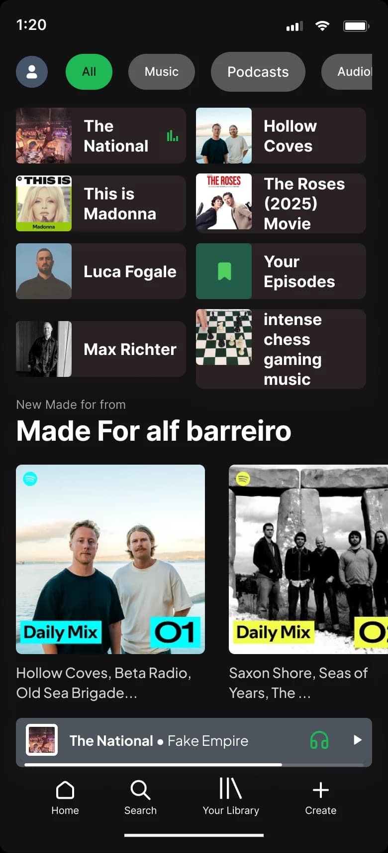
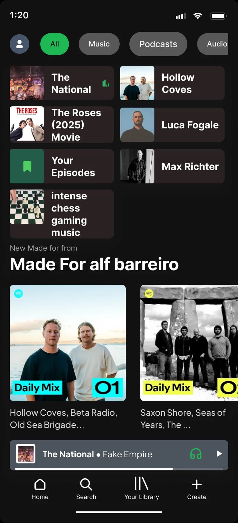
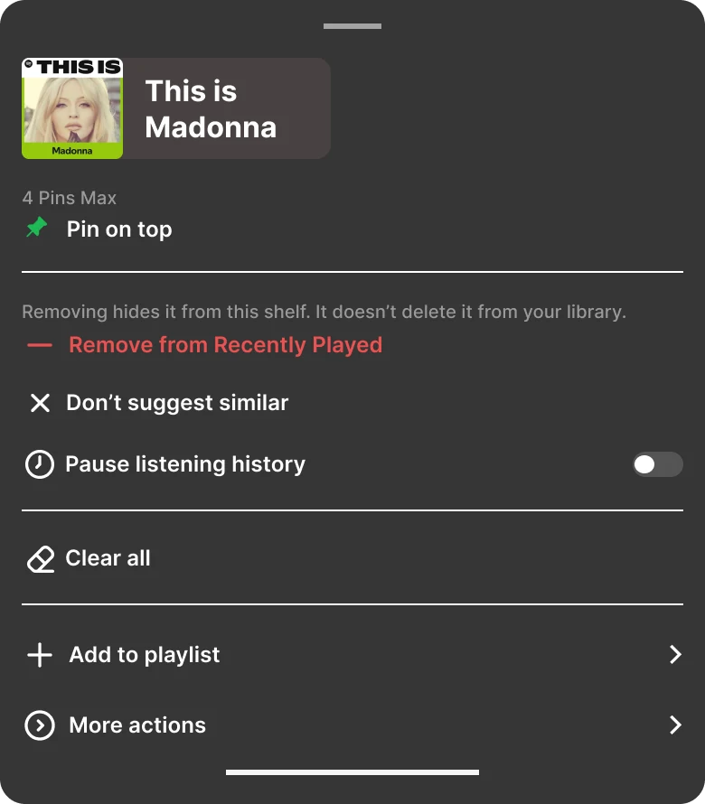
Long-press an item on the Recently Played shelf; the action sheet opens with Pin to top, Remove from Recently Played, and Pause Listening History.

For power users · additive · reversible

Three controls for the shelf people use every day.

Spotify’s Recently Played is one of the best surfaces in consumer music. For power users on shared screens, family devices, and one-off plays, three lightweight controls add the lever they keep reaching for. The shelf broadcasts your recent plays to anyone sharing the screen, and power users are the ones who notice and care. All reversible, all native to the shelf, none touch the recommendation engine.

Pin

Keep a favorite at the front. Max four.

Remove

Hide a play without deleting it. Undo for five seconds.

Pause

Stop the shelf from logging. Time-boxed only.

“Workarounds documented in community forums are signal. People are reaching for affordances that don’t exist yet.”

Contextual friction

Where the shelf gets in the way.

Four predictable pain points that show up when Recently Played doesn’t behave the way the user’s context expects.

  • Items listened to once persist far longer than expected, cluttering the shelf and misrepresenting what users actually care about.
  • No quick way to undo or remove an item, especially when an accidental tap, short preview, or one-off experiment lands on the shelf.
  • Limited transparency around how actions shape personalization, weakening trust in Spotify's recommendations.
  • No lightweight way to pause or snooze activity during shifting contexts (shared home, guests, family visits, borrowed devices, etc.).
01

The problem.

Recently Played sits at the top of every Home feed and updates automatically from listening history. Always visible, on your screen and on anyone else’s. The shelf records every play and orders by recency. That’s the entire interaction model. Workarounds exist: community forums document users playing a track for one second and force-quitting to push it to the top. That behavior is signal. People are reaching for affordances that don’t exist yet.

Research
What users said

The signal was in the open.

No internal data, no brief. The research layer was built from public sources: Spotify Community threads, App Store reviews, Reddit, UX forum posts. AI-assisted clustering on 200+ posts surfaced six quotes that made the design unavoidable.

Recently Played is literally the ONE AND ONLY feature of the app I use.

Reddit, Oct 2024

I'd play 1 second of a track so it would show in Recently Played.

Spotify Community, 2020

That annoyed me so much I left Spotify.

Reddit, Jul 2023

Listening history is like a diary of my music journey.

Spotify Community, 2021

Apple Music lets you clear listening history. Spotify should too.

App Store, 2023

Why hasn't Spotify added a clear history option yet?

Spotify Community, Jun 2020

Melodic Melanie persona portrait

Primary persona

Melodic Melanie

The social-pressure case. Pin to surface favorites she'd share, Remove to clear plays she wouldn't.

Ranger Dave persona portrait

Secondary persona

Ranger Dave

The time-pressure case. 45 minutes on BART. If a control takes more than two steps, he won't use it.

Stephen Tan persona portrait

Negative persona

Stephen Tan

The boundary case. He doesn't engage with the shelf. If the design started serving Stephen, the feature would be too broad.

Competitive audit

Five categories.
One open slot.

Heuristic audit across seven listening platforms. Apple Music, Amazon Music, and YouTube Music all ship at least one shelf-level control. TikTok and YouTube treat the feed as inline-editable by default. Spotify ships none. The pattern is in the open.

The five categories

Clear all · Pause history · Remove single · Inline controls · Reversible.

YouTube Music reference screen captured for the competitive audit.
YouTube Music
Apple Music reference screen captured for the competitive audit.
Apple Music
TIDAL reference screen captured for the competitive audit.
TIDAL
Amazon Music reference screen captured for the competitive audit.
Amazon Music
Deezer reference screen captured for the competitive audit.
Deezer
SoundCloud reference screen captured for the competitive audit.
SoundCloud
PlatformClear allPause historyRemove singleInline controlsReversible
YouTube MusicLimited
Apple Music
Amazon Music
TikTok / YouTuben/an/an/a
Spotify (today)
Spotify (proposed)

Swipe to see more →

Spotify today: no per-item control of any kind. The proposed row shows the three new controls (plus a settings-level Clear All, scoped out of this case study).

Decisions
The cut decision

What I cut, and why.

I started with three controls for the Recently Played shelf: Pin, Remove, and Pause. I couldn’t ship all three as equals, so I ranked them against one question. Which one fixes a problem the shelf actually leaves you stuck with?

Remove won. The shelf shows what you played to anyone looking at your screen, and there’s no clean way to take something off it. Pin is additive, a preference, not a fix. Remove solves the actual pain.

Pause stayed, but time-boxed. A permanent pause changes what the shelf is. A temporary one hands you control for the moment you need it, then the shelf returns to normal on its own.

Edge cases

Edge cases I considered.

Remove has to be reversible. If it deletes instead of hides, it repeats the exact destructive pattern I’m critiquing, so undo is part of the control, not an add-on.

Pause needs an expiry you can see. When the time-box ends, the shelf comes back on its own, and no one should have to remember they paused it.

User journey

Where the controls land.

One-frame journey across the Recently Played shelf. Peaks and valleys mapped against the three opportunity points where Pin, Remove, and Pause each earn their slot.

User journey map. Recently Played shelf with the three opportunity points called out.

Swipe to explore · full view on desktop →

Sketches & mid-fi

From paper to pixels.

Three interaction directions sketched on paper before any Figma frame. The winning direction survived three tests: does it preserve discovery, is it reversible, does it sit native to the shelf. Mid-fi mocked the answer on both surfaces (mobile + desktop) before any hi-fi work.

Sketches

Three directions on paper.

Each direction tests a different affordance for the same shelf. Lightweight, reversible, native to the surface the control lives on.

pin

Pin item to top.

Desktop wireframe: right-click menu on a Recently Played tile with 'Pin on top' at the top of the list.

Right-click a tile. Pin on top sits at the top of the menu, with the four-pin cap named inline as a header.

pause

Pause listening history.

Desktop wireframe: a shelf-scoped 'Pause listening history' pill sits above Recently Played.

A shelf-scoped pill above Recently Played. One click freezes the whole shelf, and the state stays visible.

remove

Remove from Recently Played.

Mobile wireframe: long-press opens an action sheet with Remove from Recently Played on the surface.

Long-press opens the action sheet with Remove on the surface. Don't suggest similar sits below for the softer signal.

Mid-fi · desktop + mobile

Two surfaces, before the annotation.

The wireframes the annotated walkthrough below refers to. Worth seeing the layouts raw before reading the rationale behind each interaction beat.

Mid-fi desktop wireframe of the Recently Played shelf with the new action sheet pattern.
Desktop · mid-fi
Mid-fi mobile wireframe of the Recently Played shelf with the new action sheet pattern.
Mobile · mid-fi
Details
Three controls, decoded

Pin. Remove. Pause.

Each control gets the same editorial treatment: title, the annotated walkthrough, then three paragraphs naming the problem, the trade-off, and who wins. The looping prototypes live in their own tabbed section below.

PIN · Mobile

Pin.

Max four pins. Long-press, choose, swap. The cap teaches itself.

  1. 01Long-press. The action sheet opens with Pin sitting at the top of the list.
  2. 02The tile locks in. A Pinned snackbar with Undo runs for five seconds so the choice stays reversible.
  3. 03Order settles. The pin takes the first slot and holds it, regardless of what plays next.
  4. 04Long-press again. The same menu opens with Unpin as the primary option so undo stays cheap.
  5. 05Cap hits at four. A limit modal names the ceiling and offers to swap rather than a soft warning toast.
  6. 06Pick a swap. The new tile takes the freed slot and a confirmation toast closes the loop.

Problem and state coverage. Recently Played reorders by recency. A song the user wants to keep within reach disappears as new plays push it down. The shelf needs a way to lock a favorite in place. The new Pin state machine covers seven moments: default, hover, press, pinned, disabled (cap reached), loading, error. Each has two independent signals so the affordance never reads as ambiguous.

Feedback and the cap. Move first, confirm second. The tile animates to position one in 250 ms; the Pinned. Undo snackbar follows for five seconds; a persistent Pin chip stays on the tile after the snackbar dismisses. The cap is four pins, with a disabled fifth row rather than a soft limit and a warning toast. Engineering surfaced shelf-performance and ranking-signal degradation past four; four is also the cognitive ceiling for what a user can re-find by sight. Drag-to-reorder among pins, deliberately cut.

Persona impact. Ranger Dave on his commute is the primary beneficiary. Pin keeps his focus playlist within one tap regardless of what he plays after. Parent is neutral. Pin on a shared device is rarely worth doing. Explorer is neutral to negative; heavy browsing means the shelf turns over quickly and four pins barely scratch the volume.

REMOVE · Mobile

Remove.

Per-device. Five-second undo. Library untouched.

  1. 01Long-press. The action sheet opens with Remove from Recently Played on the surface.
  2. 02Tap Remove. The tile begins its 220 ms slide-out so the change reads as movement, not deletion.
  3. 03The row clears. A Removed snackbar with Undo runs for five seconds and holds the reversal open.
  4. 04Tap Undo. The snackbar acknowledges the restore before the tile animates back in.
  5. 05The tile returns. It lands in its last position and a Restored toast confirms the reversal completed.

Problem and state coverage. An accidental tap, a short preview, a one-off experiment lingers on the shelf and misrepresents what the user cares about. They need a way to clean it up before someone sees. The Remove state machine handles default, hover, press, the successful remove, the active toast, sync conflicts, and the restored state after Undo. Single-item rows and multi-item rows handled distinctly.

Feedback and scope. Slide first, undo second. The tile slides out in 220 ms. The Removed. Undo snackbar runs for five seconds. On undo, the item returns to its last position rather than the front. Scope is per-device, not per-account. Privacy lives at the device boundary. The cost is friction for multi-device users. The benefit is that the shelf can’t betray a user’s intent on Device A by changing on Device B.

Persona impact. Melodic Melanie, the primary beneficiary, can clear contextual plays before she shares her screen. Ranger Dave is positive on the shared-device case. Explorer is neutral. The shelf already turns over fast for them.

PAUSE · Mobile

Pause.

Time-boxed. 30 minutes, 2 hours, until tomorrow. Resume is automatic.

  1. 01Long-press the header. The action sheet treats the whole shelf as the target, not any single tile.
  2. 02Tap Pause. A duration picker replaces the sheet so the next tap picks a time-box, not a toggle.
  3. 03Pick a preset. Thirty minutes, two hours, or until tomorrow. Three answers cover every real use case.
  4. 04Paused state visible. The shelf carries a countdown so the pause is a promise, not a hidden mode.
  5. 05Timer expires. A toast confirms that listening history is running again before the shelf refills.

Problem and state coverage. A borrowed phone, a long drive with a guest, an overnight kid takeover. The user has no way to stop the shelf from logging without leaving the app or signing out. The Pause state machine surfaces the timer in every state: default, hover, press, paused, expiring, resumed, clock-skew error. The timer is the design’s promise.

Feedback and the time-box. Three presets, no slider. The duration picker offers 30 minutes, 2 hours, or until tomorrow. The shelf shows the paused state with a countdown; a snackbar confirms when listening history resumes. The control is time-boxed only, not a permanent toggle. Permanent pause was ruled out because the ML signal would degrade. The cost: a user who really wants to opt out has to re-pause periodically, or use Settings · Privacy.

Persona impact. Parent is the primary beneficiary: Pause protects recommendations during somebody else’s listening session. Melodic Melanie is positive on the social case. Ranger Dave is positive on shared devices when his son’s music threatens to take over the shelf.

Interactive prototype  ·  try the three controls

Read the spec. Then try it.

Pick a row in the shelf below, then use one of the three controls under it. The demo runs against the constants above.

PIN_CAP = 4  ·  UNDO_WINDOW = 3s  ·  PAUSE_PRESETS = [30m, 2h, tomorrow]

Choose an artist to pin or remove

KeyboardPPin selected tileRRemove selected tileSpacePause and resume⌘ZUndo the last change
02

The bet.

Three additive controls, all native to the shelf, each completing in one or two taps. Pin to keep a favorite within reach. Remove to hide an accidental or contextual listen without deleting it from the library. Pause to stop the shelf from logging for a time-boxed session. Reversible by default. Nothing touches the recommendation engine. Permanent pause was ruled out because the ML signal would degrade. Time-boxing is what survived the stakeholder map.

03

Shipped, with receipts.

Three controls, two affordances (mobile long-press, desktop right-click), one state machine. Below: the Pause state diagram that locks the time-boxed behavior, then the honest scope of what wasn’t tested.

State diagram · Pause

Time-boxed, four states, every transition reversible.

Pause state diagram: four states (idle, paused, expiring, resumed) with every transition reversible.

Swipe to see more →

Out of scope

Four things that got named, defended, and skipped.

Knowing what not to design is the same skill as knowing what to design. Each item below was raised, considered, and deliberately left for a different surface or a different team.

Skipped

Editing global listening history

This touches a different surface (Settings → Privacy) and a different stakeholder group. Scoping it here would expand the project beyond one sprint.

Skipped

Changing ranking algorithms

Recommendation logic is owned by a separate team. Any ranking changes would require cross-team alignment that's out of scope for a shelf-level UX feature.

Skipped

Profile privacy redesign

Friends-feed and listening visibility live in a different settings surface. They deserve their own design pass, not a piggyback on this one.

Skipped

Permanent pause toggle

Permanent pause was ruled out at the constraint stage. The ML training signal degrades fast with persistent pause. Time-boxing is what survived.

Desktop parity

Same logic, native shell.

Mobile uses long-press to open the action sheet. Desktop uses a right-click context menu. The three controls and their state machines are identical. Only the affordance changes.

Spotify Desktop Recently Played shelf with the right-click context menu showing Pin, Remove from history, and Pause history actions.

Swipe to see more →

  1. Pin on top
    Right-click menu
  2. Remove from Recently Played
    Right-click menu
  3. Pause listening history
    Shelf header pill
Desktop right-click menu · same actions, native pattern
Evaluation

How I’d know it worked.

This is a concept, so there are no live numbers and I won’t invent any. Here’s the test I’d run instead. Put the prototype in front of five power users who share a screen at home or at work. Success is narrow: they can take an item off the shelf in one action, undo it if they change their mind, and say what Pause does without me explaining it. If they can’t undo, Remove is just the destructive pattern again, and the concept fails its own point.

Role

UX/UI Designer · End-to-end

Year

2026

Stack

Figma · Principle · After Effects

Status

Self-directed concept · not shipped

Design log  ·  the receipts

What actually happened, in order.

  1. Feb 04, 2026

    First stakeholder read of the brief. Framed the problem as agency without signal loss, not history editing.

  2. Feb 12, 2026

    Ruled out permanent pause. Time-boxing survived the ML-signal-integrity review.

  3. Mar 03, 2026

    Cap set at four pins after engineering flagged shelf-perf degradation and ranking-signal noise past four.

  4. Mar 21, 2026

    Undo window locked at five seconds. Matches the existing snackbar pattern; nothing new for the user to learn.

  5. Apr 08, 2026

    Mobile long-press vs desktop right-click parity confirmed. Affordance changes, state machine does not.

  6. May 02, 2026

    Reduced-motion path documented. Every animated state has a static fallback that carries the same information.

Signed  ·  Alfonso Barreiro